Inspiration
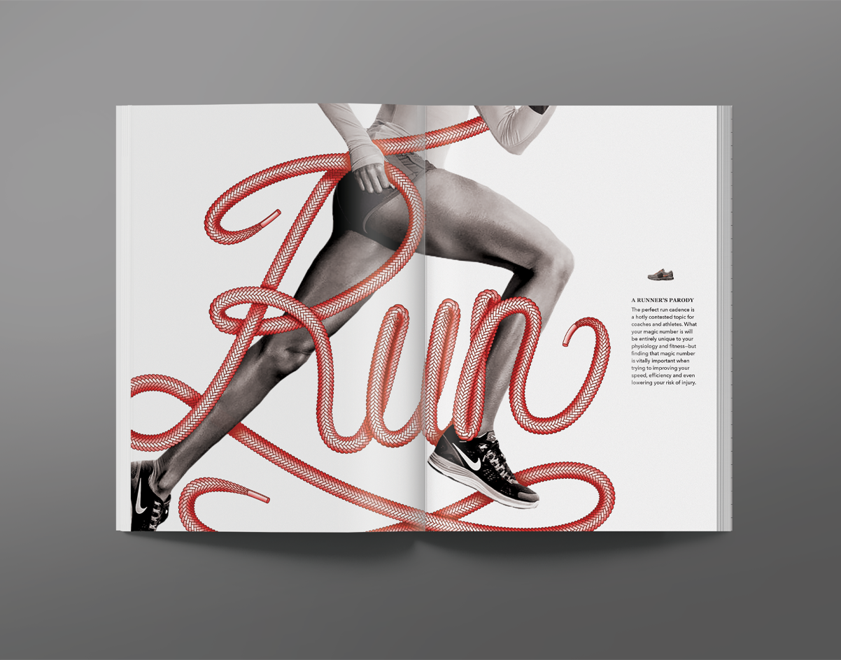
Being an avid runner myself, I am all too familiar with the feeling of when you are in the peek of your run, your blood is pulsing through your veins, and your heart and mind are working in tandem to get you to the finish line. I used this feeling to power my design in hopes of creating a visual that would communicate this same sense of strength.
Meaning
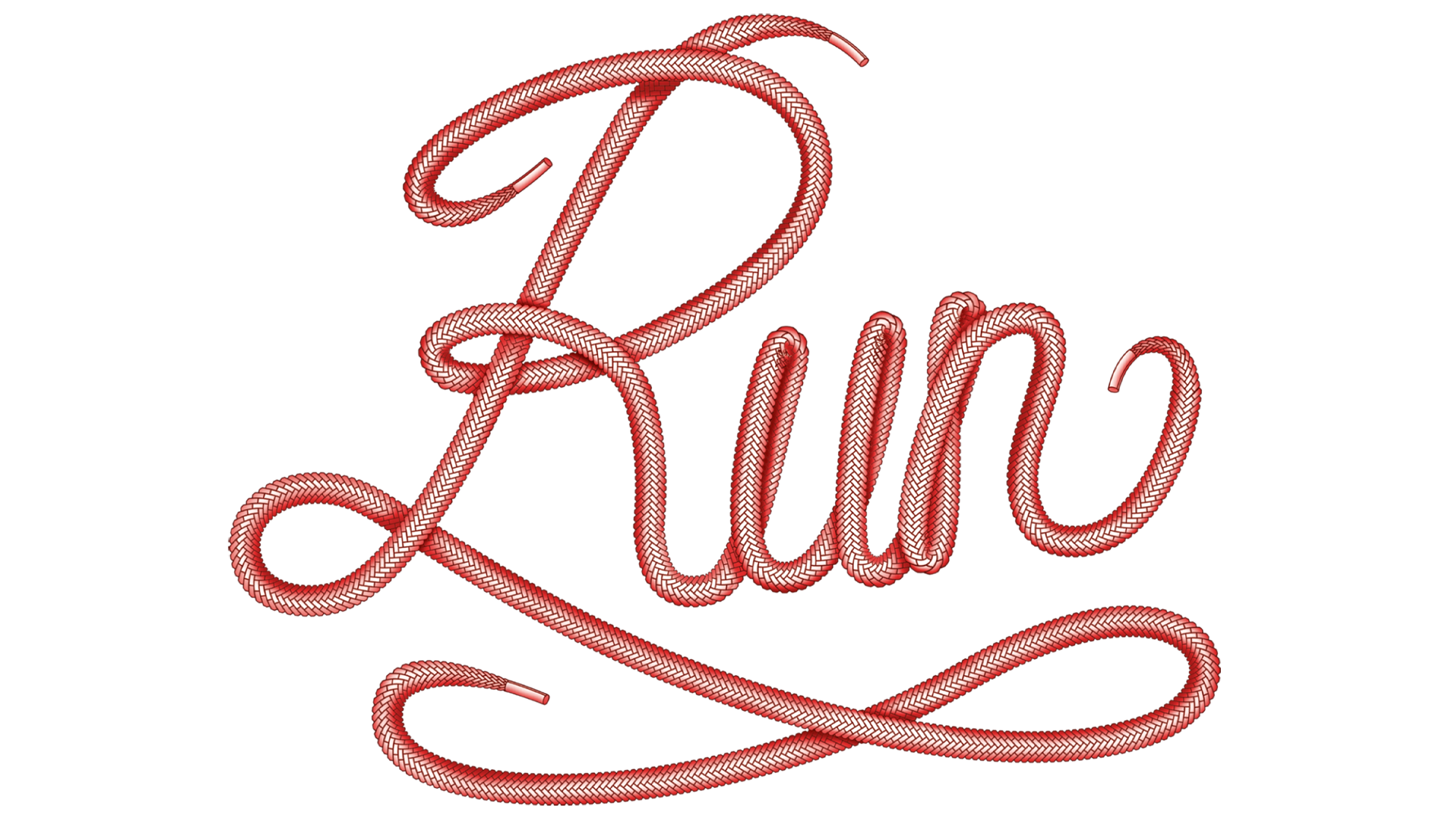
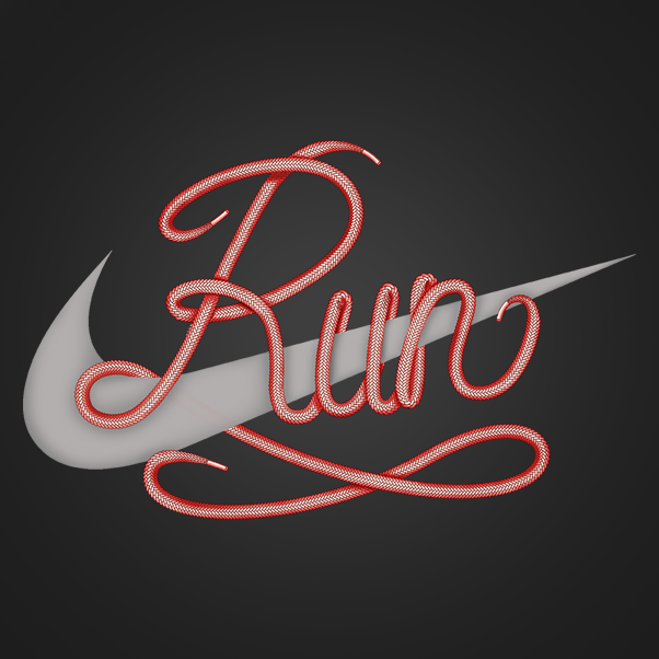
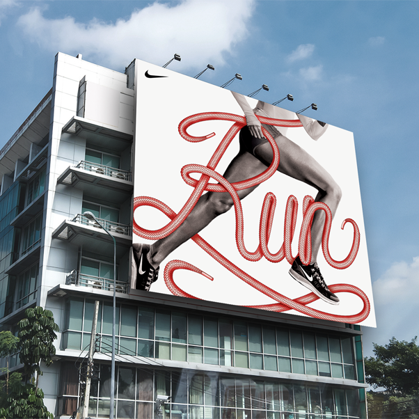
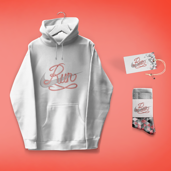
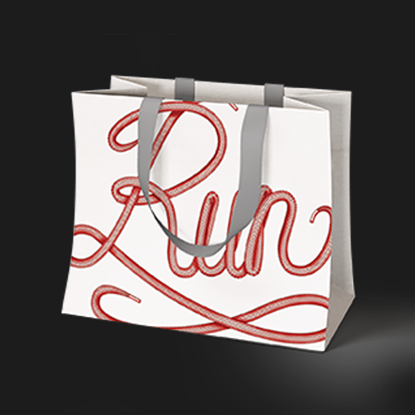
The wordmark “Run” takes on a fluid, swift motion and is created with red shoelaces. The color red in the shoelaces is symbolic for coursing blood and increased heart rate. The color and shape come together to act as a metaphorical representation for power, determination, and agility.
